How to Choose the Right Traffic Warning Signs?
Traffic warning signs guide drivers through hazards they may not see until it is too late. A sharp bend behind a hedge, loose gravel near a work area, or a low bridge can change a routine trip in seconds. Choosing the right sign means more than selecting a bright color or familiar symbol. It requires matching the warning to the actual risk, the road environment, and the time drivers have to respond.
Start by identifying the hazard clearly. Then consider approach speed, sight distance, traffic volume, weather, and whether the condition is temporary or permanent. A sign placed too close to a bend may be noticed only after braking begins. One placed too far away may lose urgency. Visibility matters in rain, dusk, and headlight glare, while wording and symbols should be easy to understand at a glance. Keep it readable.
Traffic warning signs should also be durable, securely mounted, and checked after installation. Faded reflective material, a leaning post, or branches across the sign can weaken even a well-chosen message. Guidance from qualified traffic-safety professionals and applicable local standards can help confirm placement and specifications. Conditions differ. A solution that works on a quiet access road may not suit a busy urban route. In practice, the choice can be less tidy than a checklist suggests; a site visit may reveal a blind approach or confusing background that plans missed. Revisit the location, record any changes, and adjust when needed. The safest sign is one drivers can notice, understand, and act on in time.
Classify the Hazard and Select a MUTCD Warning-Sign Symbol
How to Choose the Right Traffic Warning Signs?
Classify the Hazard and Select a MUTCD Warning-Sign Symbol
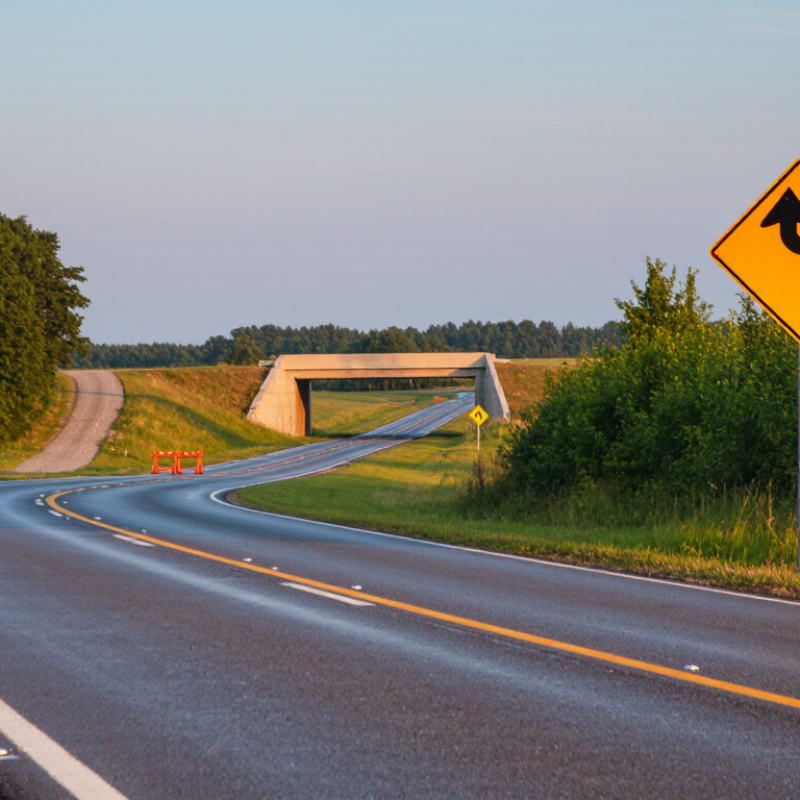
A useful warning sign names the hazard drivers will meet, not every condition nearby. Start by observing the road at driver eye level. Is the concern a sharp curve, a side road, a pedestrian crossing, or workers ahead? Match that hazard to the appropriate symbol in the current MUTCD, rather than creating a custom picture. A familiar symbol can be recognized faster. A vague one can leave drivers guessing.
Check the setting before settling on a sign. A curve on a clear rural road may need different placement from one hidden beyond parked vehicles. Consider approach speed, sight distance, lighting, and whether the hazard changes by time of day. Not always obvious. On site, a sign that seems right on a map may be hard to see behind a tree branch or around a bend. I would recheck the view from an approaching vehicle, then confirm the symbol and placement against current MUTCD guidance and local traffic-engineering requirements. If the hazard does not fit a standard symbol neatly, pause and seek qualified review instead of forcing a close match.
Size the Sign for Its Roadway Context Using MUTCD Table 2C-2
Choosing a warning-sign size starts with the road, not the signpost. MUTCD Table 2C-2 lists recommended minimum sizes by sign type and roadway context. Identify the sign designation, then check the column for the facility where it will be installed. A curve warning on a low-speed local road may call for a different minimum than the same warning on a higher-speed road. Use the table’s exact dimensions; do not assume one size fits every setting.
Then inspect the approach as a driver would. A sign partly hidden by branches, competing with roadside clutter, or viewed at night may be harder to notice. A larger sign can improve conspicuity, but it cannot replace suitable placement, visibility, or maintenance. Small details matter. FHWA’s MUTCD provides the sizing reference, while NHTSA reported 42,514 U.S. traffic fatalities in 2022. That figure describes the wider safety stakes, not proof that sign size alone prevents crashes. Field judgment also has limits: document unusual conditions and check local requirements before installation. A sign that looks large in daylight can seem surprisingly small from a fast-moving vehicle.
How to Choose the Right Traffic Warning Signs? - Size the Sign for Its Roadway Context Using MUTCD Table 2C-2
| Roadway context |
Typical minimum size for a standard warning diamond |
How to apply the size |
| Freeways and expressways |
36 × 36 in (914 × 914 mm) |
Use the larger baseline size where drivers travel at higher speeds and need more time to recognize the warning. |
| Conventional roads |
30 × 30 in (762 × 762 mm) |
This is the typical baseline for standard warning diamonds on conventional roads. Check the applicable sign row and any project-specific requirements. |
| Residential streets |
24 × 24 in (610 × 610 mm) |
This smaller baseline may suit lower-speed residential settings when allowed by the applicable MUTCD provisions. |
Important: These are typical baseline dimensions, not a complete reproduction of MUTCD Table 2C-2. Minimum size can vary by sign type and roadway context. Confirm the current MUTCD edition adopted by the road authority, the specific sign’s requirements, and any applicable state or local standards before specifying or installing a sign. A larger sign may be appropriate where speed, visibility, or roadside conditions call for greater conspicuity.
Set Advance Placement: AASHTO Stopping Sight Distance Is 305 ft at 40 mph
At 40 mph, AASHTO stopping sight distance is commonly stated as 305 feet. It represents the distance a driver needs to perceive a hazard, react, and bring a vehicle to a stop under assumed conditions. That distinction matters. It is a design reference, not a promise that every driver can stop within that distance.
For advance warning signs, consider how much time drivers need to notice the sign, understand its message, and respond before reaching the hazard. A sign placed exactly 305 feet ahead may leave too little time to read and act, especially near a curve, intersection, or busy driveway. Check the actual approach speed, road grade, sight obstructions, and likely visibility at night or in rain. Heavy vehicles may need more room to slow. Follow applicable agency guidance and use qualified engineering judgment.
Walk or drive the approach from a driver’s viewpoint. Look for branches, parked vehicles, glare, and competing signs that hide the warning. A sign should be visible early, not suddenly appear beside the hazard. I would not treat 305 feet as magic; it is easy to repeat and harder to apply. Field conditions can make a tidy number feel inadequate.
Choose Nighttime Visibility Using ASTM D4956 Retroreflective Sheeting Types
Traffic warning signs must remain readable after daylight fades. ASTM D4956 classifies retroreflective sheeting by performance, but the type alone cannot guarantee clear visibility. Type I engineering-grade sheeting may suit lower-demand settings, while higher-performance prismatic types can help drivers see signs from farther away. The right choice depends on road speed, lighting, sign size, and the distance available to react.
Consider the actual roadside. A sign beside a bright, busy intersection faces different conditions from one on a dark rural curve. Headlight angle, sign placement, dirt, and aging also affect how much light returns to drivers. Check the current ASTM D4956 requirements and your local road authority’s specifications before choosing a type. A brighter sheet is not automatically the best fit; excessive brightness or poor placement can still make a message hard to read. That detail is easy to overlook.
Tips: Compare expected viewing distance with the sign’s location. Inspect sample signs at night using approaching headlights, and check them again when wet. Keep records of installation dates and condition. If visibility seems inconsistent, review placement and maintenance—not just the sheeting type.
How to Choose Traffic Warning Signs for Nighttime Visibility
A qualitative guide to common ASTM D4956 sheeting groups—not a measured brightness or visibility-distance comparison.
Engineering-grade Types I–II are a basic option; Types III–IV and prismatic Types VII–X are commonly considered when greater nighttime conspicuity is needed. Types V and VI have specialized constructions and applications, so assess them using the product’s specifications. ASTM type alone does not establish a universal viewing distance or brightness: check the sheeting’s retroreflectivity data, sign color and geometry, road conditions, and applicable requirements.
Verify Mounting Height: MUTCD Typically Requires 7 ft in Urban Areas and 5 ft in Rural Areas
A warning sign can be easy to miss when it sits too low behind parked vehicles or roadside plants. Check its mounting height before judging its visibility. Under typical MUTCD guidance, the bottom of a sign is generally at least 7 feet above the sidewalk in urban areas where pedestrians may pass beneath it. In rural areas, 5 feet is commonly used, measured from the road surface to the bottom of the sign. Measure twice.
These figures are useful starting points, not universal answers. The required clearance can depend on the sign’s location, nearby sidewalks, other signs, and the rules adopted by the local road authority. A sign beside a busy walkway may need more clearance than one on an open shoulder. Check the current MUTCD provisions and local specifications before installation, and confirm exactly where the height is measured.
Use a tape measure from the relevant ground or pavement surface to the sign’s lower edge. Then look from a driver’s approach: can the sign be seen above parked cars, tall grass, or a snowbank? A height that meets a typical minimum may still leave the sign partly blocked. Field conditions can be awkward, and measurements are easy to misread on sloped ground. Recheck the clearance after installation, especially where sidewalks or maintenance work may change the surrounding surface.